The ever-increasing global consumption means that there is also an increasing interest in the studies conducted to further understand consumer behavior as well as the investments in marketing and product development. There is a huge competition between global brands. And, understanding more about consumer behavior is one of the most important tools that brands can use to their own advantage. When it comes to consumer behavior, there is no doubt that colors play an incredibly important role.
Understanding the effect of colors on consumers is one of the most important aspects of determining the right marketing strategies for brands because they have an obvious effect on consumer decisions, regardless of whether or not the consumers themselves are aware of these effects. We are all more or less aware of the fact that each color represents a certain emotion or concept and has a certain impact on human psychology. For example, while shades of red and pink represent love and passion, white represents innocence and green represents nature. Colors are also frequently used for literary purposes as metaphors or symbols. Separation, longing, illness and melancholy are symbolized by yellow, for instance.
Considering the fact that even the dominant colors in a room affect our mood, it is pretty obvious that they have a huge impact on the decisions taken by consumers. When we have a look at the relationship between colors and the consumer, there are various aspects we need to tackle, such as the color of the packaging or the product itself, the colors used in the brand logo, the colors that make up the brand identity, etc.
The Emotions Evoked by Different Colors Are Great Tools for Brands
In order to better understand the relationship between colors and the consumer, we first need to understand the features that differentiate colors from one another. What we mean by “a color” is determined by three main properties: hue, lightness, and chroma. Different variations of these three properties is what helps us create different colors. And, each color has a different impact on human psychology and consumer behavior. On the light spectrum, hue is what you yield via different combinations and variations of the six primary colors whereas chroma refers to the intensity of a given color. Lightness is used to identify how light or dark a color is. Through different variations of these three main properties, we acquire thousands of different reds and blues and greens. Each shade of red and each shade of blue have their own properties and evoke different emotions, of course.
In a study about colors and their connotations, participants were asked to describe the colors they see. The study showed that the brighter a hue, the more positively it is perceived by the participants, based on how they describe the colors they see. 75% of the participants used words like “energy”, “passion”, and “rage” to describe red. For orange and yellow, the descriptions were along the lines of “joy” and “happiness”. However, when it comes to gray and brown, the responses varied. This shows that some colors have weaker connotations than others, and the effect of a given color on human psychology is not limited to the properties of the color itself but it also depends on the context the color is being used. Brands also take this fact into consideration when they are about to decide on the color or colors to represent their brand identity.
How Do Colors Affect Consumer Behavior?
Studies show that it takes only 90 seconds for consumers to decide whether or not they are going to buy a product. And, the colors used on the packaging or the brand logo have a 62-90% effect on this decision. That’s why using colors to their own advantage is incredibly important for packaging designers, marketing experts and brand executives.
In his study about the impacts of psychological associations of colors on consumer behavior, J Suresh Kumar says that brands should use a very specific formula to build their brand identity. Adhering to this specific formula is very important to get noticed amongst hundreds and thousands of competitors. When it comes to design; harmony of colors, shapes, functions and the overall aesthetical value are crucial. And, in order for the brand to be recognizable on all platforms, the company website, mobile app, product packaging, store/venue decorations must also reflect the same color scale. For instance, if a bank uses green on their logo, they should use the same green on their debit cards, credit cards, invoices, ATMs, bank branches and advertisements as well as their website and mobile app.
When a brand is about to decide on the colors to be used on their brand identity, they need to take their target audience, product category, product quality and pricing strategy into consideration. For instance, red is usually known to represent urgency and speed. So, it is no coincidence that red is used on the logos of fast food chains like Burger King or McDonald’s, because when you step into the restaurant or see the logo on an app, the red gives you the signal that you will receive a fast service here.
You can click below for further information on the subject:
The Importance of Colors Used on Packaging and Brand Logo
When we see a product in the store, what we actually see is the packaging, not the product itself. The role of product packaging is not limited to preserving the product, it is also about attracting the customer’s attention and providing information about the product. That’s why it is crucial to reflect the colors and design that make up the brand identity on the product packaging. In addition to using the brand colors correctly, design, shape and functionality are also important factors to be considered when it comes to packaging. So, even though colors play a crucial role in marketing and packaging design, the packaging will be a failure unless the right combination of shape, design and functionality is employed. This will not only decrease sales but also ruin brand awareness.
We see that popular online retailers like Amazon and AliExpress use black, red and orange. Nowadays, brands tend to simplify their logos and employ single colors on their brand identity and other visual services.
A brand’s logo is like a signature and a symbol that helps it to get noticed amongst thousands of competitors, so it crucial to use the right colors. The aim here is not just to use the most aesthetically pleasing color combinations. The colors should also reflect the product category and the services provided by the brand. For instance, in the study mentioned above, the participants’ responses about colors like brown varied a lot while they had mutual responses for red. Let’s have a look at the most popular and successful coffee brands in the world. We see that brown is the prominent color to be used in their brand identity. Using different shades of brown in combination with green and yellow will give an idea about the products provided by a brand. Even though brown, as a color, do not have a distinct association as red does, when it is used in the right context, it becomes a powerful tool. So, what defines the associations pertaining to a given color has also to do with the context and it doesn’t solely depend on the properties of the color itself. The connotations of a color are shaped within a context consisting of crucial factors such as the societal values, product category, brand identity, etc. For instance, white represent innocence and cleanliness in Europe, the Middle East and the US, while it represents death and mourning in Japanese and Chinese cultures. Therefore, examining how colors impact consumer behavior should also involve a thorough study of certain concepts like cultural differences, age group, gender, income bracket, etc.
Marketers use color psychology to create specific visual cues that can influence what people buy on e-commerce websites. Here are a few examples of how colors can be used in the context of internet shopping:
Red "sale" or "discount" banners on a website may attract customers attention and encourage them to buy.
A blue background on a website may create a sense of trustworthiness and security, making customers more likely to enter their personal information and make a purchase.
A green color scheme on a website for an eco-friendly or natural products store may create a sense of health, growth, and environmental responsibility, making customers more likely to buy.
A black background and white text on a luxury brand website may create a sense of elegance and exclusivity, making customers more likely to buy high-end products.


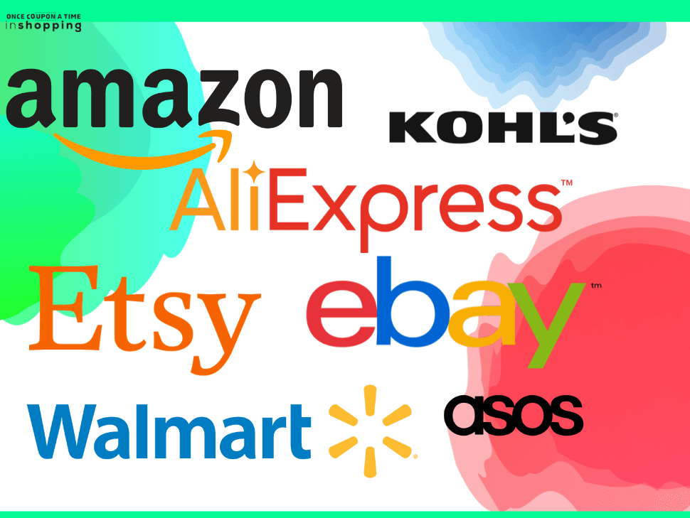 We see that popular online retailers like


REVİEWS - 1 reviews